
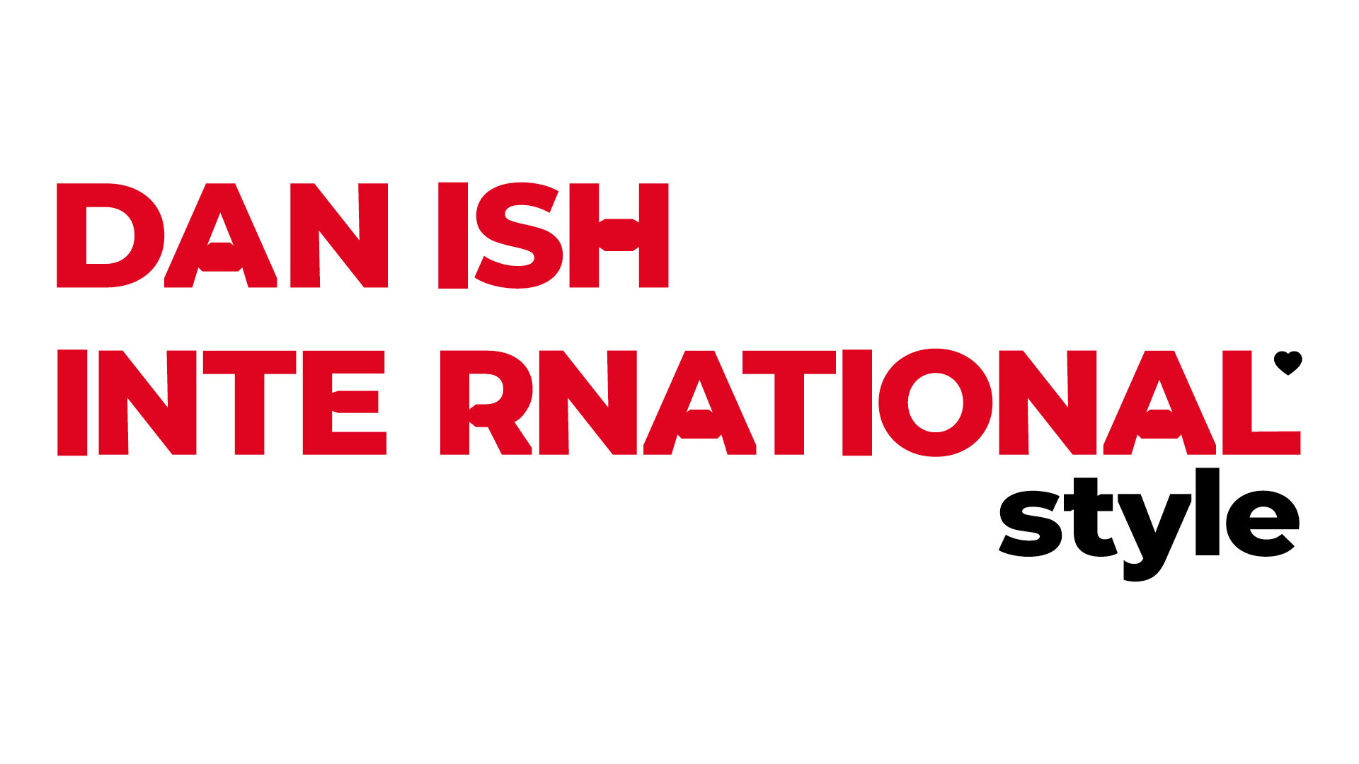
Visit Denmark.
Brand Identity.
_
Denmark as a nation wanted to stand out in a crowded marketplace, both within Scandinavia and globally. The visual language created for the Country taps into their heritage of fairytales in a way that feels grown-up, modern and fresh.
_
Design and Art Direction
Created at Fold7, 2018
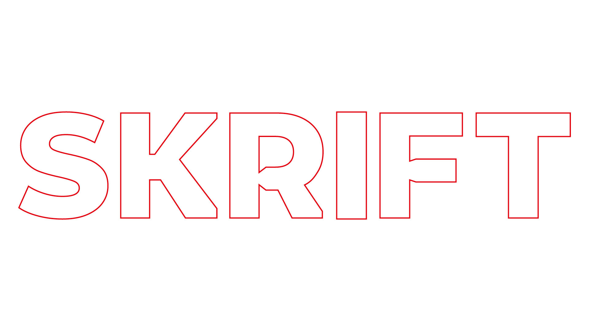
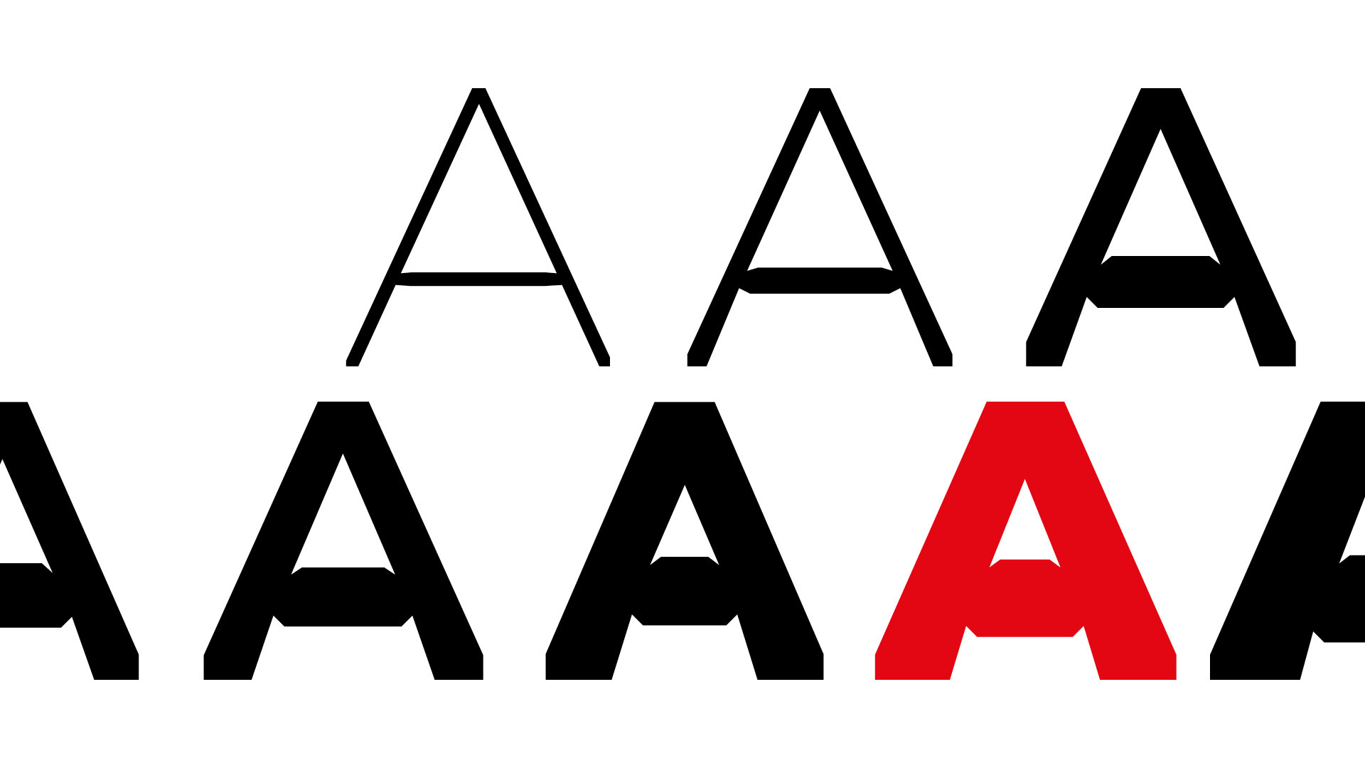
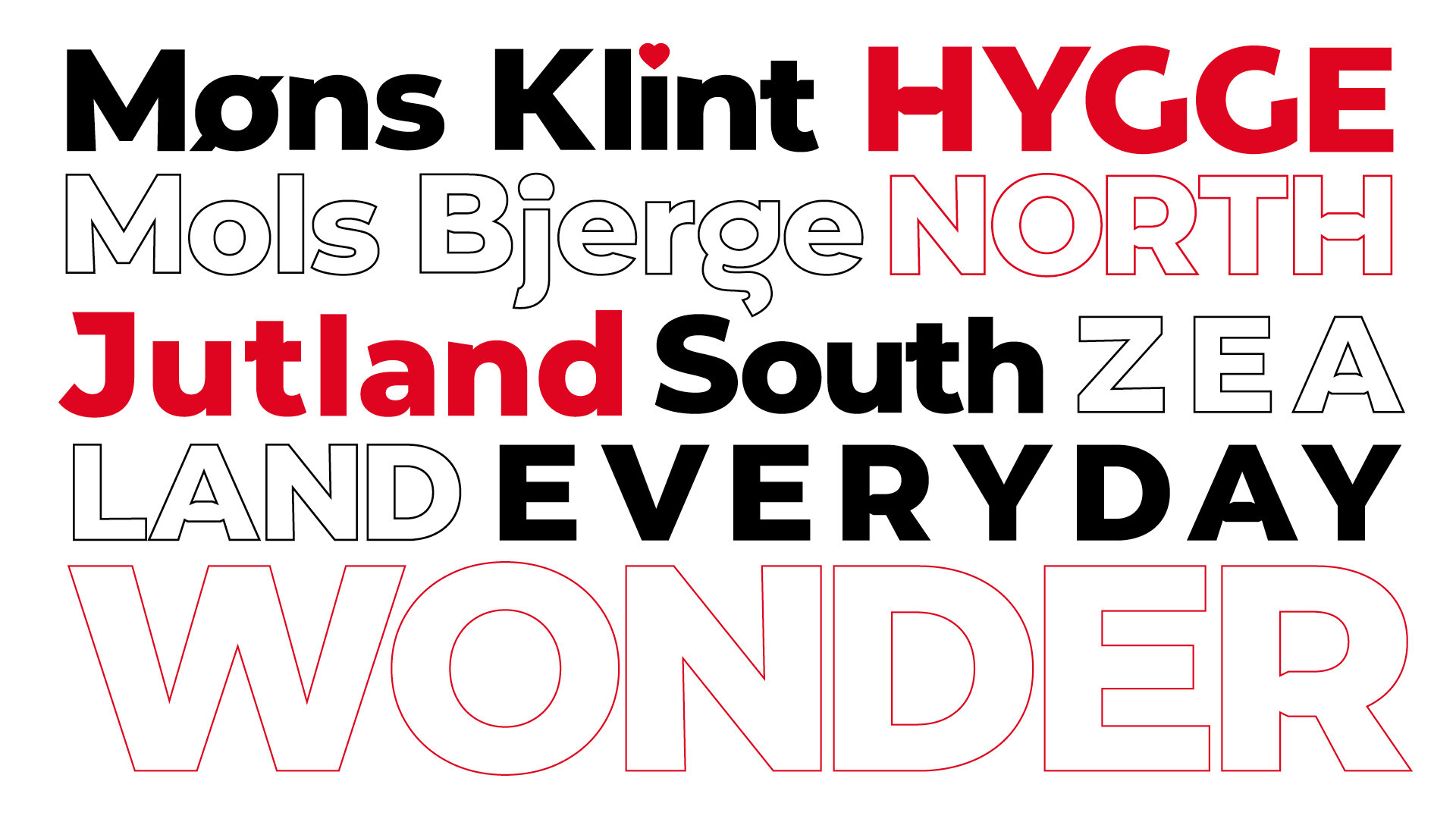
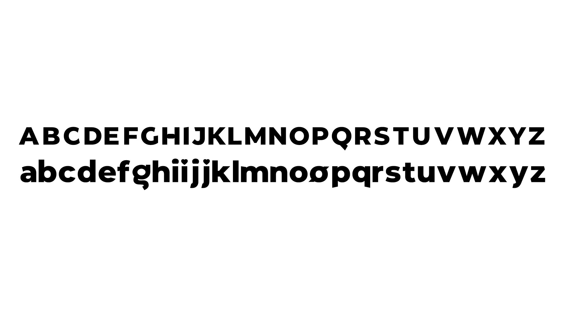
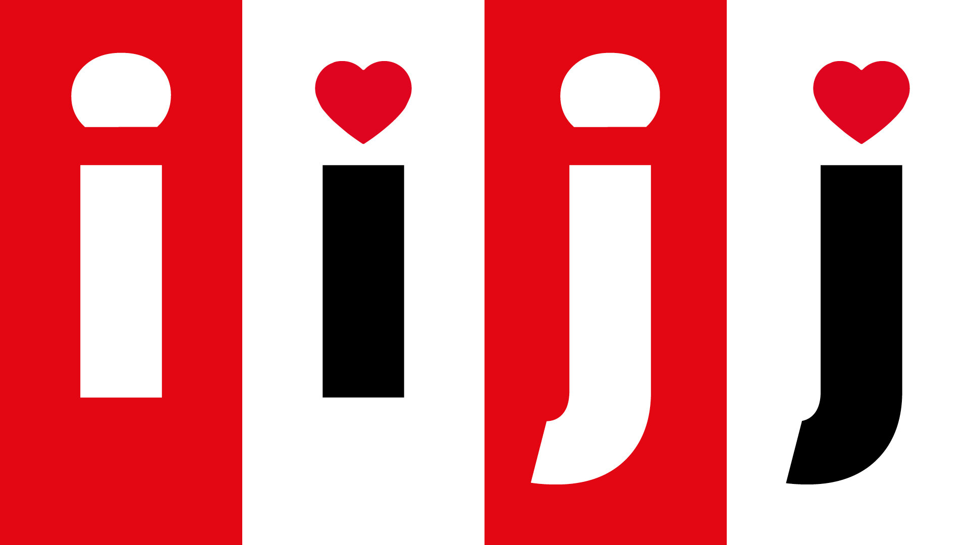
Font
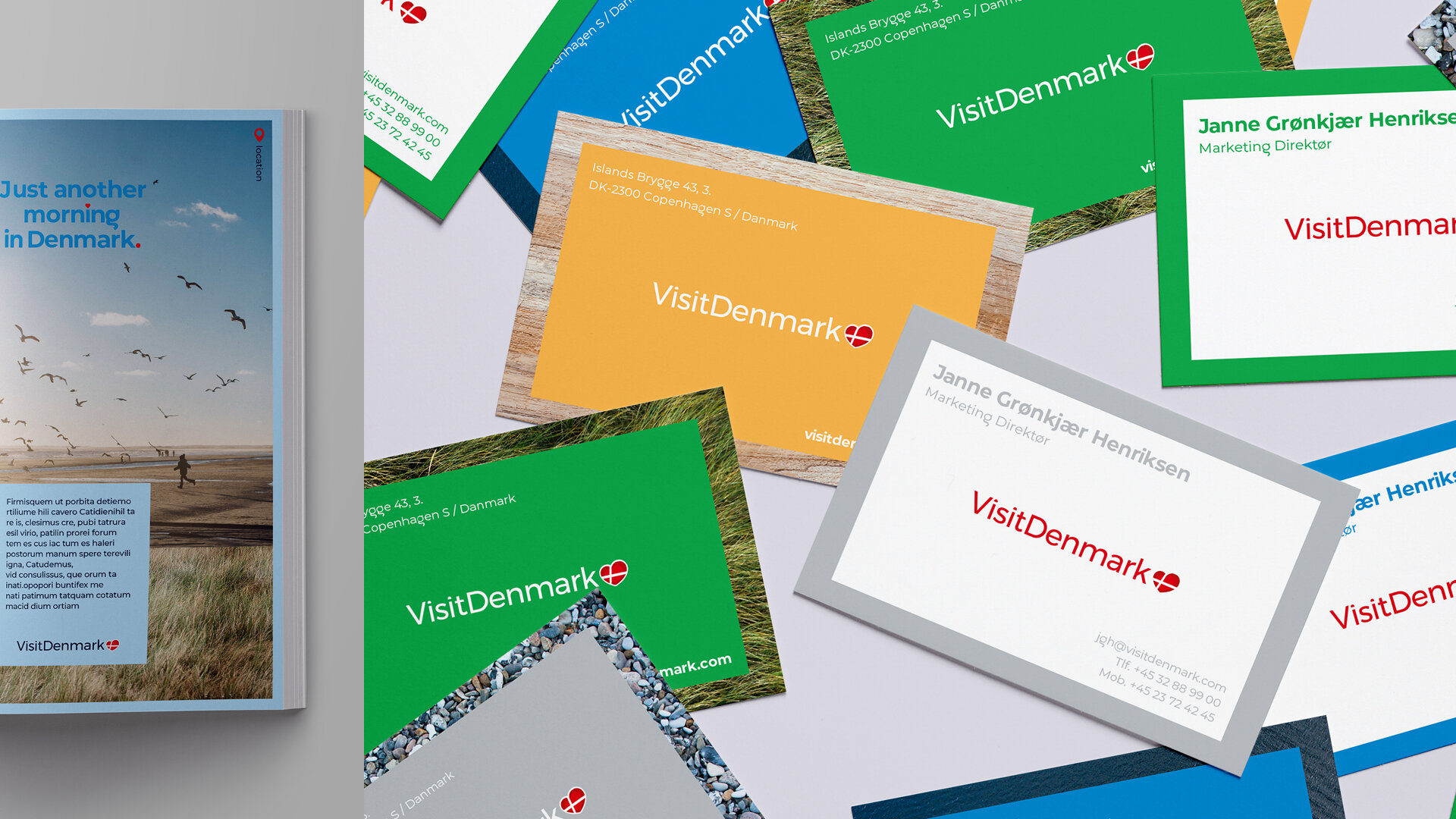
The Visit Denmark brand had already begun using a simple sans serif, which while elegant lacked a danish personality. By building in Danish typographic style cues to their existing face, including the iconic ❤ that tops the lower case j on the Copenhagen road signage, the custom face, ‘Skrift’ subtly embodies the spirit of Danish style.


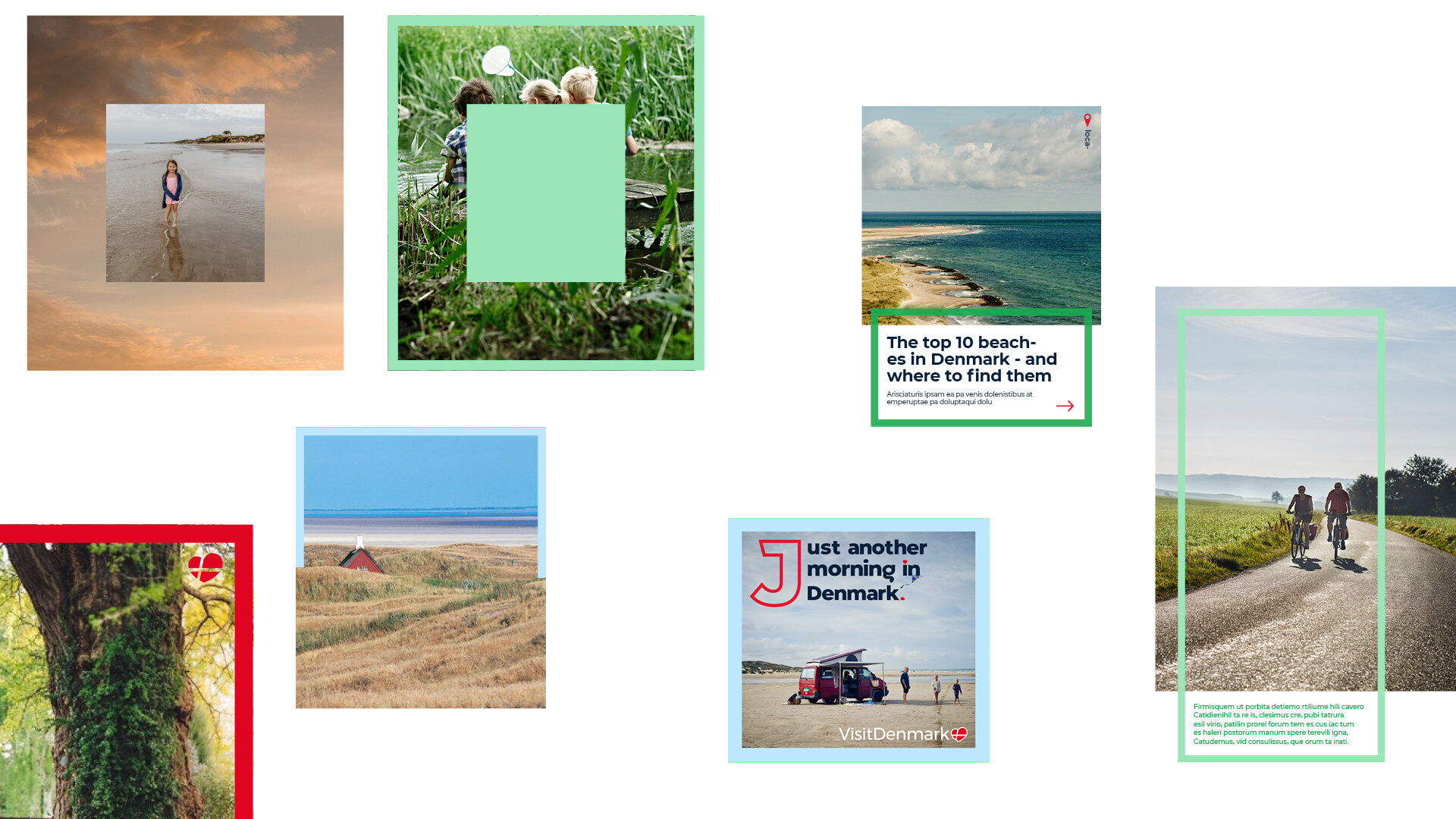
Photography and colour
Denmark is so much more than Copenhagen, with many varied and beautiful landscapes. These have been both the influence for the colour palette, and the basis of a library of photographic textures that can augment and sometime replace flat colour within the work.
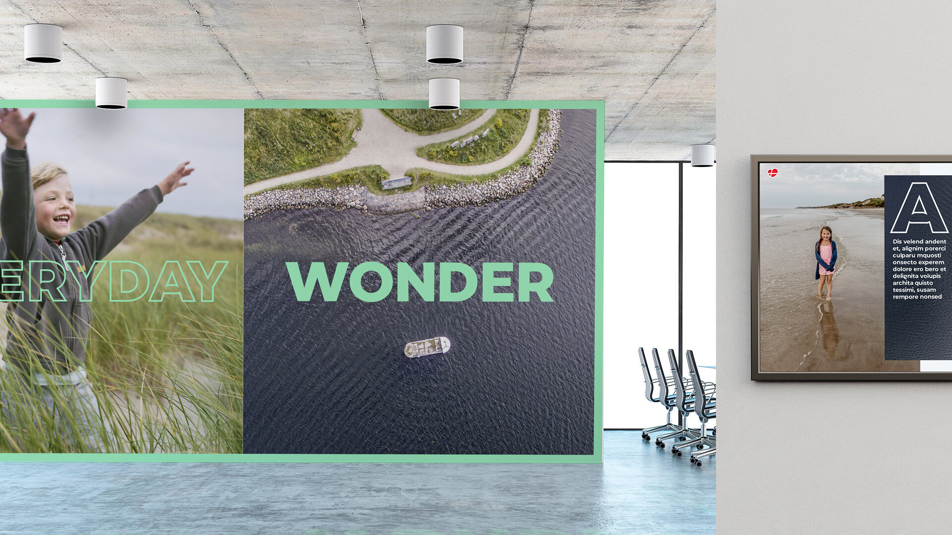
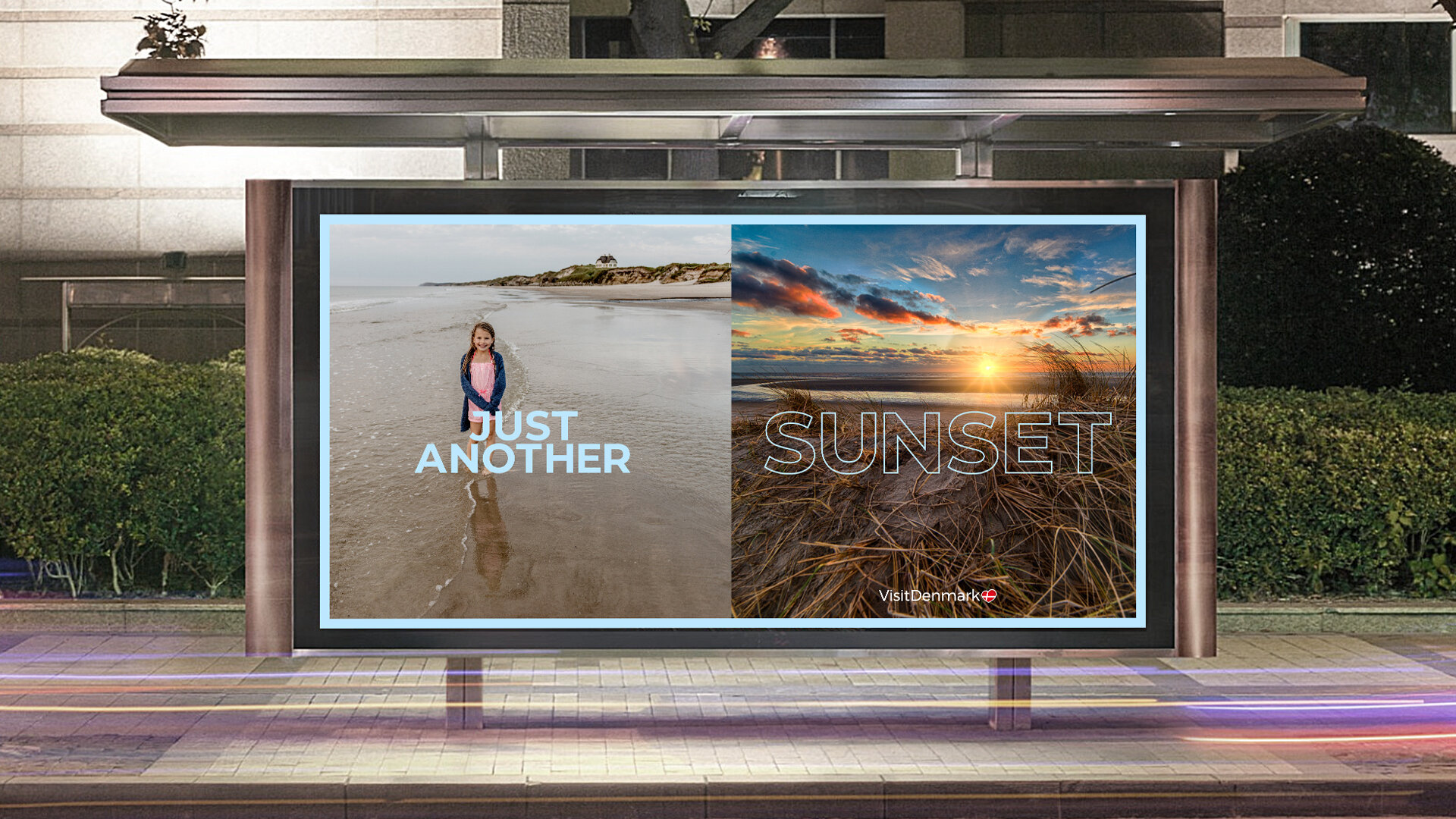
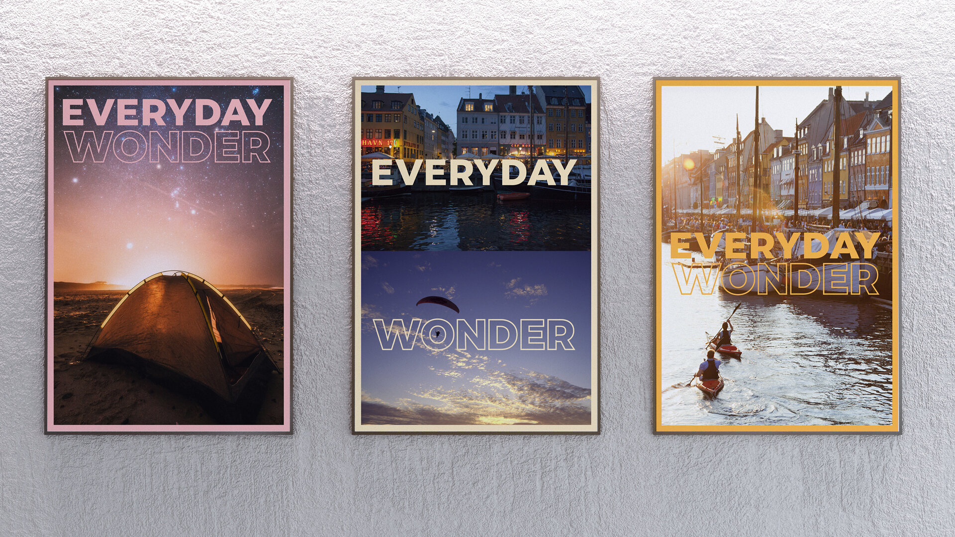
Multiple image
The brand system allows for heavy use of multiple juxtaposed images, allowing the unique nature and narrative of Denmark to really shine through. This allows you to combine macro and micro, human and landscape, day and night, whatever best tells the story.
Framing and dropcaps
Framing and dropcaps are the final two cornerstones of the visual language. Both are evocative of traditional storytelling, but delivered minimally and in the context of this brand feel they fresh, ownable and surprising.
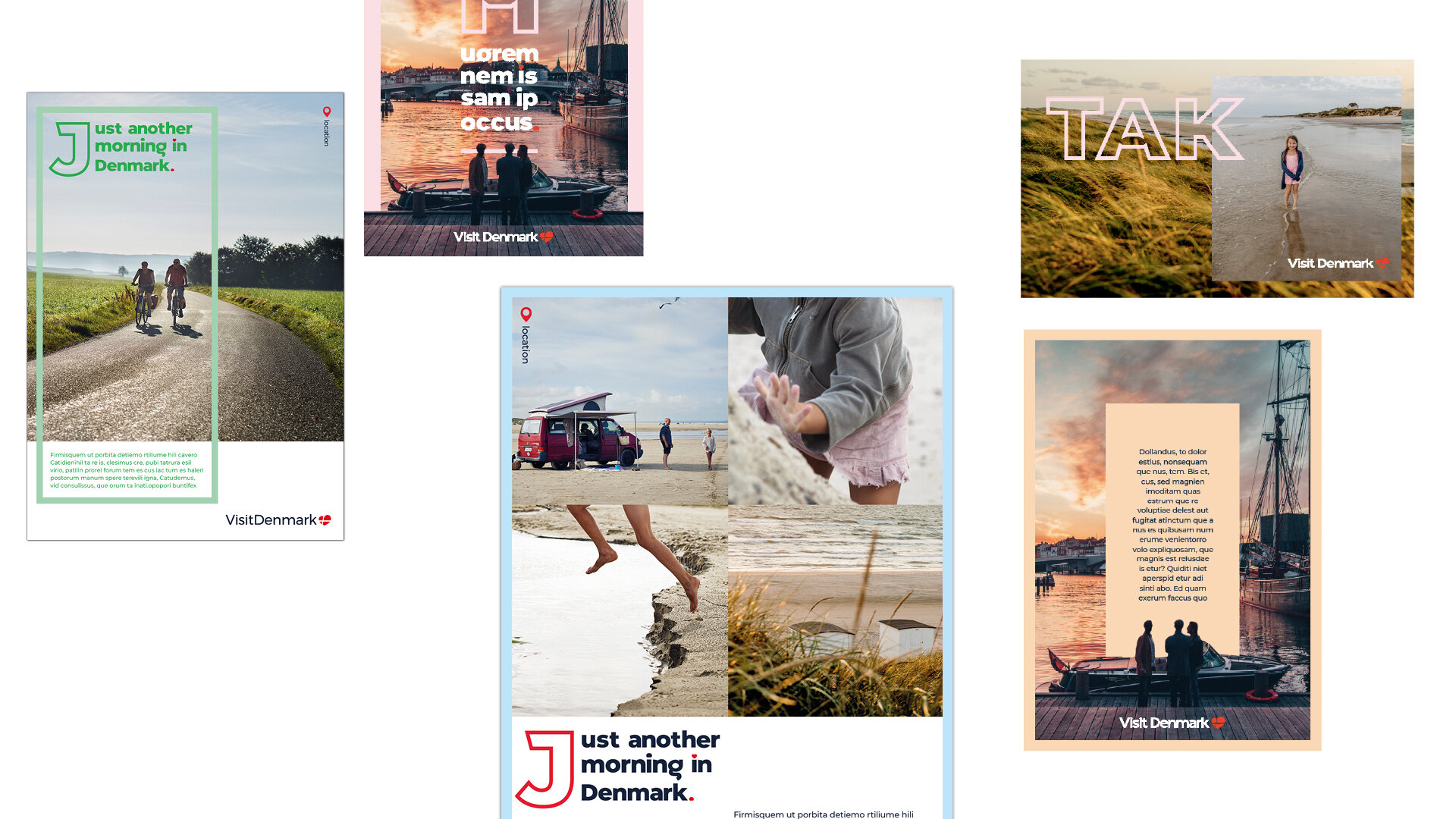
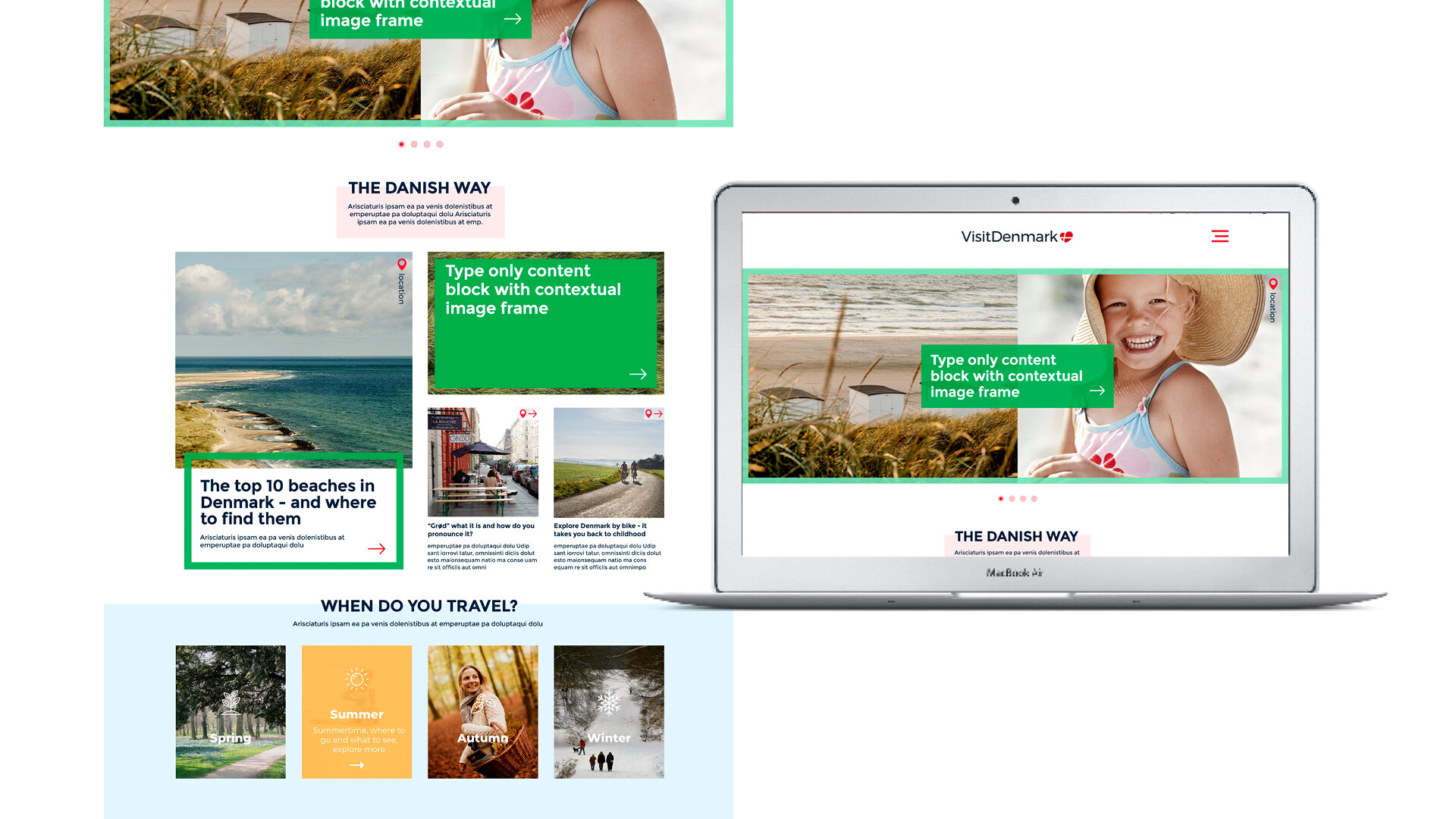
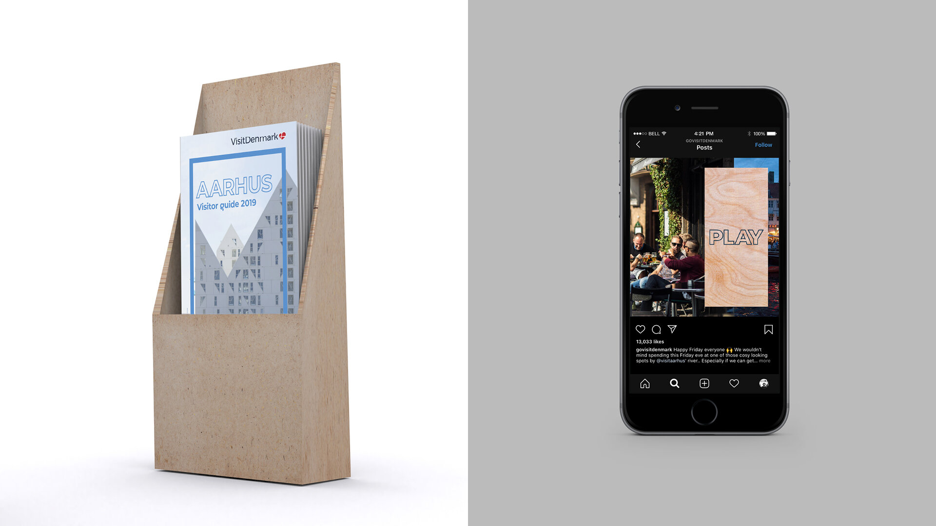
All of these elements provide a recognisable and distinctive kit of parts that the brand can leverage globally across it’s many touchpoints and channels.